Graph Types
The PStats server offers a range of different graphs, giving different views of the data being sent from the client. The graph windows can be opened from the Graphs pull-down menu, but they can also be opened by right-clicking a particular collector in a chart.
Time-based Strip Charts
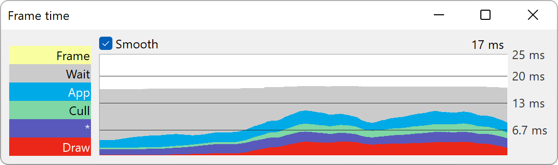
This is the graph type you will use most frequently to examine performance data. The horizontal axis represents the passage of time; each frame is represented as a vertical slice on the graph. The overall height of the colored bands represents the total amount of time spent on each frame; within the frame, the time is further divided into the primary subdivisions represented by different color bands (and labeled on the left). These subdivisions are called “collectors” in the PStats terminology, since they represent time collected by different tasks. The top-most label indicates the collector that is currently being viewed, and the labels below it indicate its subdivisions.
Normally, the primary collector is called “Frame”, representing the total amount of time spent rendering a particular frame. This is subdivided into App, Cull, and Draw, the three stages of the graphics pipeline, a Wait collector for time spent waiting on other threads or VSync, and a further * collector for operations that may occur across multiple stages. Any remaining time not specifically allocated to one of those child collectors is assigned to the parent “Frame” collector (normally, there should not be significant time reported here).
All of these categories contain further subdivisions, which themselves may be subdivided further, if this data is provided by the client. For instance, App is often divided into Tasks, Animation, and Collisions, where Tasks is the time spent executing any Python code, Animation is the time used to compute any animated characters, and Collisions is the time spent in the collision traverser(s), etc.
To see any of these further breakdowns, double-click on the corresponding colored label (or on the colored band within the graph itself). This narrows the focus of the strip chart from the overall frame to just the selected collector. Not only does it make it easier to observe the behavior of that particular collector since it is drawn alone (as opposed to being stacked on top of some other color bars), but if there are further breakdowns to this collector, they will now be shown as further colored bars. As in the Frame chart, the topmost label is the name of the currently focused collector, and any time shown in this color represents time allocated to the current collector that is not accounted for by any of the child collectors. To return to the parent level, simply double-click this top-most collector.
The time spent in the currently focused collector, averaged over the past three seconds, is drawn above the upper right corner of the graph. By default, this is shown in milliseconds, which is a better metric than a target frame rate, but the unit can be changed from the Units pulldown menu if desirable. Some collectors will additionally show a number indicating how often they were started in the latest frame.
Value-based Strip Charts
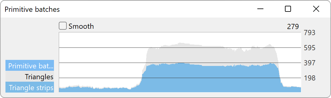
There are other strip charts you may create, which show arbitrary kinds of data per frame other than elapsed time. These can only be accessed from the Graphs pulldown menu, and include things such as texture memory in use and vertices drawn. They behave similarly to the time-based strip charts described above.
Flame Graphs
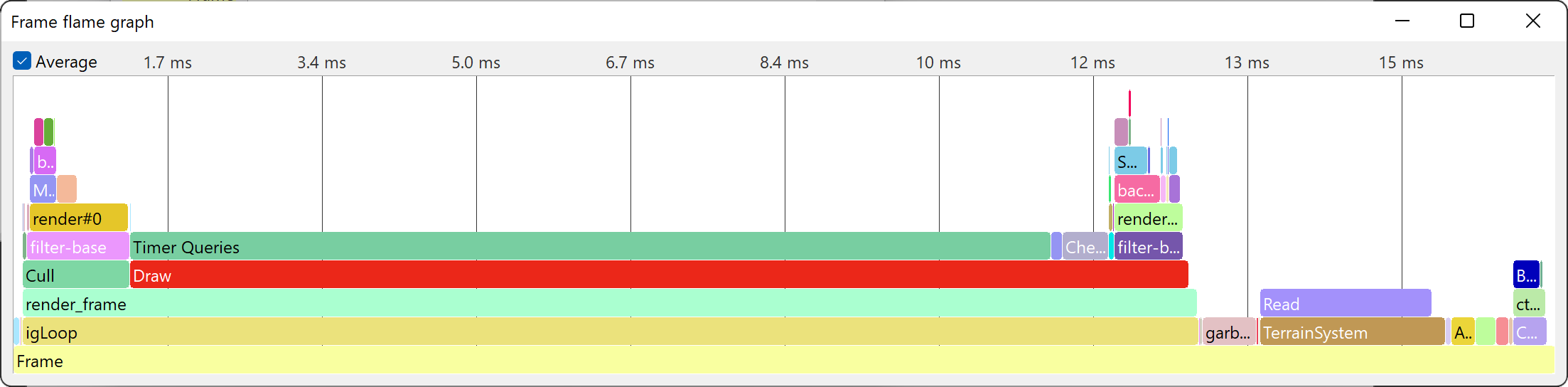
This is probably the most useful graph, giving an immediate insight into how the time is broken down in a frame or in a particular category, but it can be a bit difficult to wrap your head around at first. It collects a running average of the time spent in each collector, with the currently-focused collector (the bottom-most bar, by default the entire frame) being stretched to fit the entire width of the chart.
The way the bars are stacked indicates how the collectors are nested. Let’s say that Panda3D performs a Cull pass for display region A and B separately. The Strip Chart view would just tell you the total Cull time in the frame, which doesn’t tell you which scene you need to optimize. The Flame Graph view on the other hand will show two separate Cull bars, one stacked above the bar for display region A, and the other stacked above the bar for display region B.
You can double-click on any bar to focus in to that particular collector and see how its time is broken up. Double-click the white background to go back to the previous level. Right-clicking a bar will show further options, such as to open additional charts.
Timeline
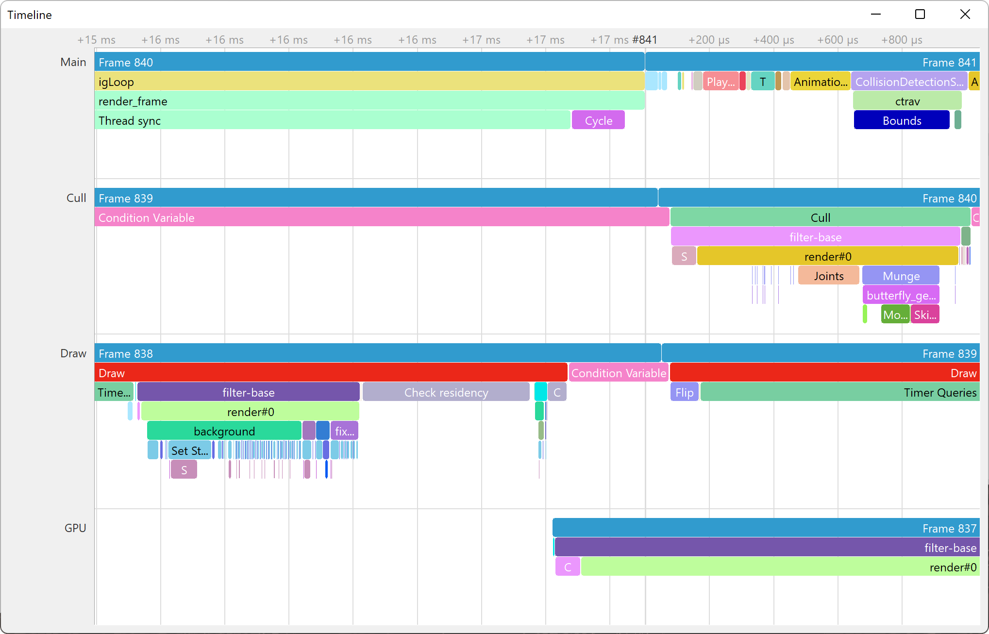
This graph is used less frequently, but when it is needed it is a valuable tool to reveal exactly how the time is spent within a frame. Sometimes you really need to know the exact sequence and timing of events in the frame, not just an accumulated time spent in each collector. For example, it is very useful for finding lag spikes that occurred only during a single frame, like during a loading process. In the Timeline chart, a bar is drawn between each start and stop event of each particular collector, with the vertical axis showing the nesting of collectors.
When using multiple threads, the timelines for the different threads are listed vertically, underneath each other. This makes it the only chart that can show multiple threads at once, making it possible to find synchronization issues. When GPU timing is enabled, the video card is considered a separate thread, but due to the fact that the GPU has a separate clock, the GPU and CPU threads may not be perfectly aligned.
There are several ways to navigate through the timeline. By double-clicking a particular bar, the view will zoom to fit that bar. You can also use the WASD keys to navigate, or the scroll wheel of the mouse while holding the control key on the keyboard. If the timeline takes up so much vertical space that it runs off the edge of the chart, you can use the scroll wheel of the mouse without holding the control key to bring everything into view.
Please note that PStats discards data older than 60 seconds by default. To be
able to see the entire timeline, you need to change the pstats-history
configuration variable (eg. you could set it to inf to never discard data).
Furthermore, it is possible to see dropped frames if the frame rate is too high
or if the send queue is full. If you wish to see all frames, increase the
pstats-max-rate and pstats-max-queue-size variables.
The Piano Roll
This graph is no longer considered very useful. It predates the Timeline chart, which is easier to read while giving a more powerful view of how the time is broken up in each frame. Nevertheless, it is still available for those who find it useful.
The piano roll chart shows the sequence of events in the last frame, not just the total time spent in each collector. It is so named because it is similar to the paper music roll for an old-style player piano, with holes punched down the roll for each note that is to be played. The longer the hole, the longer the piano key is held down. (Think of the chart as rotated 90 degrees from an actual piano roll. A player piano roll plays from bottom to top; the piano roll chart reads from left to right.)
Unlike a strip chart, a piano roll chart does not show trends; the chart shows only the current frame’s data. The horizontal axis shows time within the frame, and the individual collectors are stacked up in an arbitrary ordering along the vertical axis. It is possible that there are so many collectors that they run off the edge of the window; in this case, use the scroll wheel on a mouse to scroll through the label stack on the left side.
The time spent within the frame is drawn from left to right; at any given time, the collector(s) that are active will be drawn with a horizontal bar. You can observe the CPU behavior within a frame by reading the graph from left to right. You may find it useful to select “pause” from the Speed pulldown menu to freeze the graph on just one frame while you read it.
Note that the piano roll chart shows time spent within the frame on the horizontal axis, instead of the vertical axis, as it is on the strip charts. Thus, the guide bars on the piano roll chart are vertical lines instead of horizontal lines, and they may be dragged in from the left or the right sides (instead of from the top or bottom, as on the strip charts). Apart from this detail, these are the same guide bars that appear on the strip charts.